This week I shared highlights of our trip to Sintra and my recent trip to the Cascais museum. While you may have been enjoying my travelogues something has been bugging me.
Income Inequality
I am not sure exactly when the issue of income inequality started tugging at the back of my mind…but it has been years. But it tugs more with each passing day. I, perhaps, have a simple mind. So let me put this simply. I fear as the distance between the rich and the poor becomes greater, the U.S. may be headed toward another civil war.
So I started doing some research on the issue and I happened upon the Gini Coefficient which is an economic metric intended to represent the income or wealth inequality in a region or country. I was surprised to learn that the Gini Coefficient is used by the American CIA.
Distribution of family income - Gini index measures the degree of inequality in the distribution of family income in a country. The more nearly equal a country's income distribution, the lower its Gini index, e.g., a Scandinavian country with an index of 25. The more unequal a country's income distribution, the higher its Gini index, e.g., a Sub-Saharan country with an index of 50. If income were distributed with perfect equality the index would be zero; if income were distributed with perfect inequality, the index would be 100. - CIA.Gov/The World Factbook
Comparing Countries
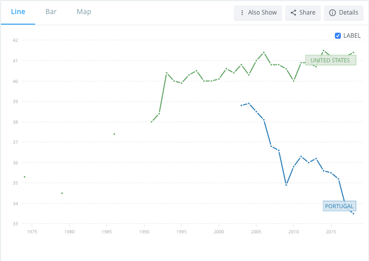
You can dig further into the data on the CIA website. But since we are American expats, living in Portugal, let’s start there. The US ranks 54 in the world with a Gini Index of 41.1 and Portugal ranks 120 with a Gini Index of 33.8. As one might expect “socialist” Europe ranks lower on the scale than the “capitalist” U.S. as you can see on the map above. The chart below shows the trend line of the U.S. and Portugal over the last 20 years.
If I had spent more time listening in my statistics course in college, I could apply a trend line for each country to show the significant difference over the past 20 years. And while the chart seems to reflect major economic events, e.g. the 2008 recession which hit Portugal even harder than the US…keep in mind the index is tracking income or wealth disparity in the country which are perhaps effected by these events.
Call me a cynic, but I have always believed that the rich get richer. And while I don’t consider us rich, like all Americans that remained in the market through the recession, and despite having lived primarily off those same investments over the past 8 years, our portfolio today is worth more than it was before “the crash”. Just consider the increase in the past 60 days…
I could inundate you with graphs comparing the 3 richest men in America to the rest of the population. But I am assuming you have not been living in a cave for the past 10 years, and have figured this out for yourself. But let me leave you with one last chart.
Specifically, look at China. Yes, I knew the Chinese were buying up a lot of New York real estate. But somehow I was surprised to learn that the largest percentage of Golden Visas in Portugal are to Chinese citizens. I guess I should not have been surprised.


Another excellent post and so true! Income inequality is such a drag on the economy and the world. It makes me so sad! I studied poverty and its effect on women for my master’s program thesis. Eye-opening. And most Americans just don’t see it!! It truly baffles me.
Another interesting post, thank you!