I often think I was an architect in a former life. So it should come as no surprise that I was looking for graph paper the night we first saw the building we ultimately purchased. If you are so inclined, permit me to encourage you to get involved.
It Really Isn’t As Bad as It Looks
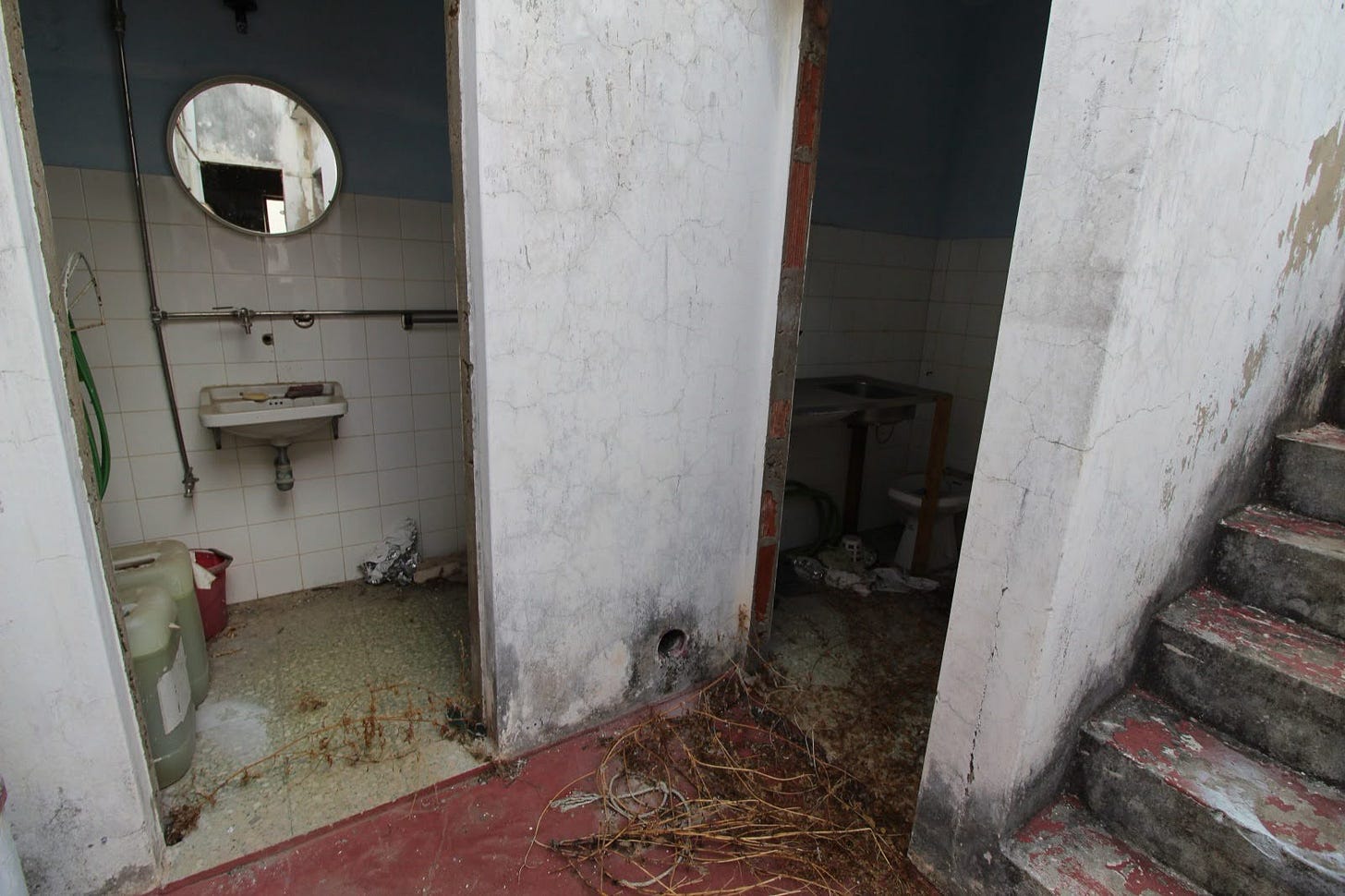
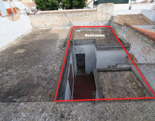
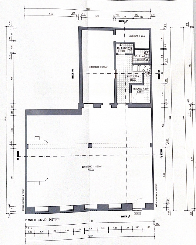
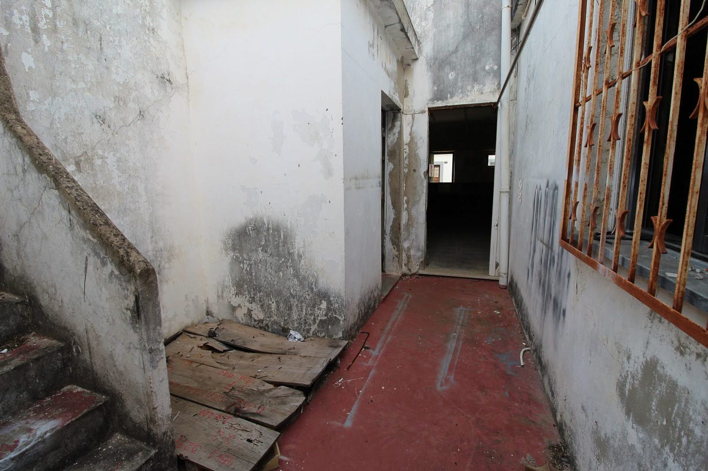
As 100-year-old buildings go, this really isn’t as bad as it looks. I recall when we were buying houses in Florida to flip I once took Denise to a house I wanted to buy. The smell in the house caused one to recall a CSI episode (too many cats and a dead body)…Denise refused to enter. (We didn’t buy the building … a shame, it was a great buy.) In this case, the building does not smell! And if we can keep the roof, there really isn’t that much demolition to do. The three small “outbuildings” in the red square above will definitely be demolished. As you can see from the blueprint below, this leaves us a fairly open space.
Zona Histórica
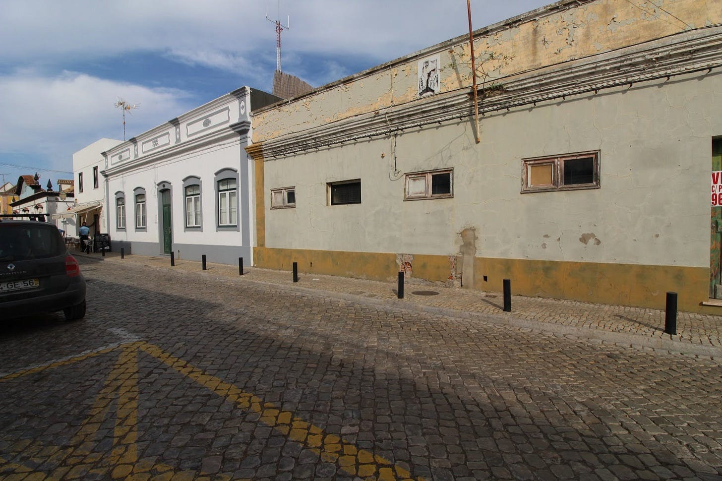
As the house is only one block from the town square (which I showed in this post) we are in the historic zone. As such the city controls exactly what the front facade looks like. There are no discussions or negotiations. It is…what it is. The windows and doors must be wood, they must be the size and placement shown below, the building must be white, and there must be a slanted tile roof (even though it is just for show).
You will note that the home to the left of ours does not comply. That is because they renovated before the city created the “new rules”. We had hoped to avoid the tiled roof and be allowed larger windows and a transom above the front doorway. We argued it made the street look more uniform. Nope!
There was a 1” thick pile of documents presented to the city, along with our €200 application fee, for approval. There are drawings of the inside of the building showing where rooms will be. But I have been told, all of those can be changed. The one thing that can’t be changed, frankly the only thing they cared about, was the facade.
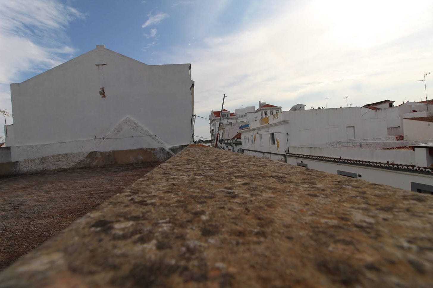
Sadly, the required fake tile “roof” impacts us negatively in three ways. First, we won’t be able to see the river anymore. I admit it wasn’t the best view, but we could say we had a water view. Secondly, and more importantly, the prior rooftop was large enough to accommodate a pickleball court. It was certainly tight, and you likely would lose some balls to the street below, but it fit. Fortunately, Onix (the pickleball company for which our dog was named) offers a skinny singles net and the wall of the neighboring building provides a backboard for practice. Finally, the front windows will be smaller than our neighbors. I suspect we will be punching a bunch of holes in the roof for skylights.
Blank Canvas
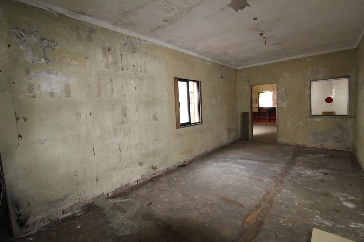
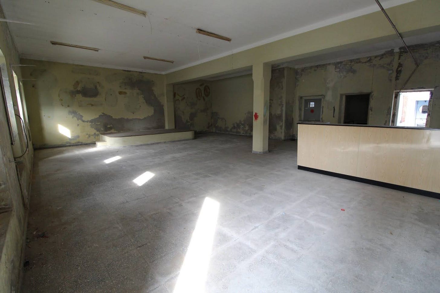
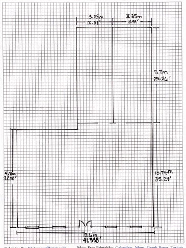
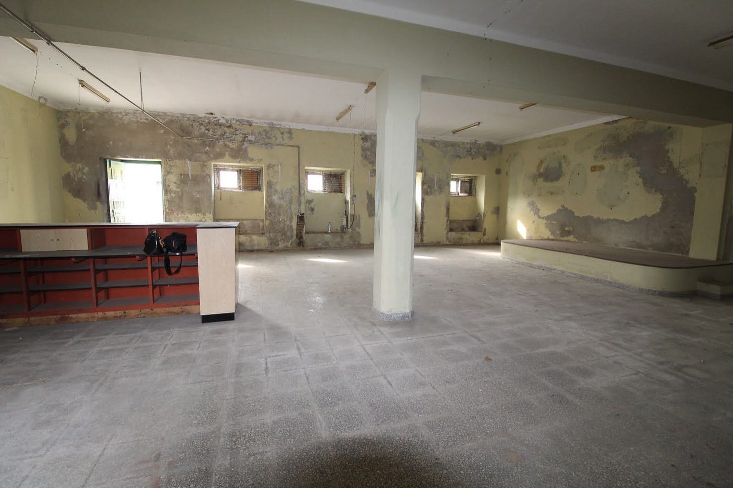
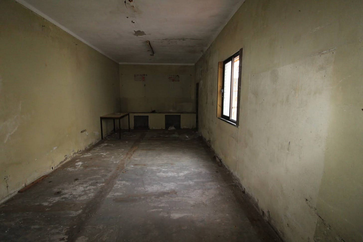
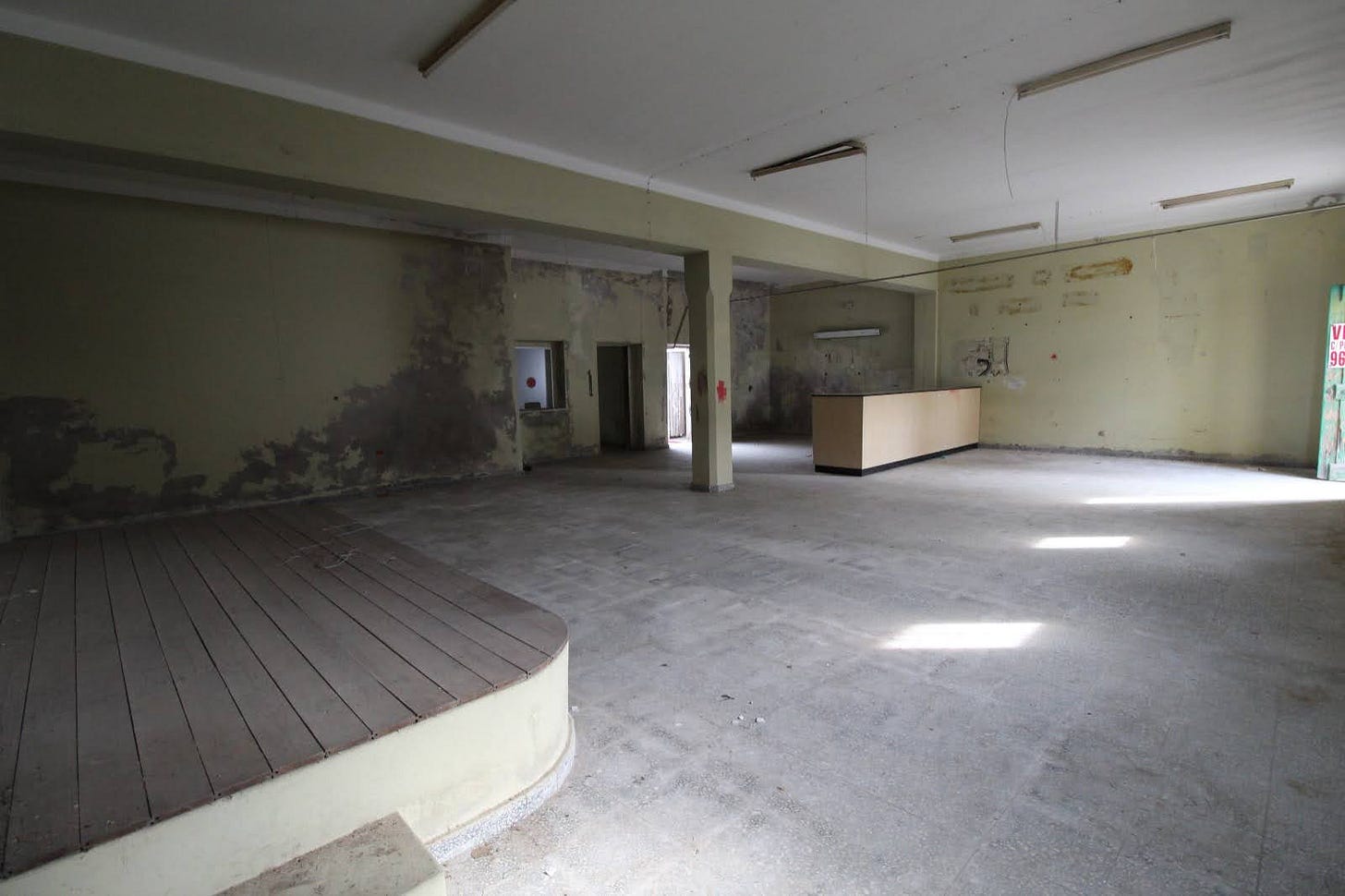
As you can see above, there are just two rooms. The large room at the front of the building is complete with a stage. Karaoke anyone? Was that a platform for the union leader to make speeches, or a place to play cards? Not sure. You can see the current entry to the courtyard through the open door on the back wall to the right. Next to it, you see another (dark) doorway that is another long, skinny room. Next to that door is an interior window, the type with a speaking hole and slot below like you might find at a ticket-buying office at a train station. I need to figure out a way to use that window somewhere!
I have redrawn the interior on graph paper above, showing dimensions in meters and feet. (Again, this is the interior dimension as the external walls are really quite thick.) I have not shown the annoying column you see in the photo above. That is because we are not sure if we will be replacing the roof as a result of the seismic survey. Also, if we can’t figure out how to hide it or make it a positive feature rather than an eyesore we will buy some very expensive steel beams and reinforce the building some other way. (I don’t want to limit your “creative juices”.)
Nonnegotiable’s
In addition to the nonnegotiable’s the city provided, we have a few:
Minimum of two (legal) bedrooms and two baths;
Courtyard for Onix and rooftop deck;
Lots of clothing storage in the master suite;
Tons of light…so yes, you can insert skylights and blow out most of the interior back walls to the courtyard;
An office (possibly third, in a pinch, bedroom) as I need room to continue to write to you (and paint…and play guitar);
Generally, we prefer open-concept (living, dining, kitchen).
At this point, we don’t want your creativity to be limited by money! Yes, of course, there is a maximum budget…but everyone we have spoken with tells us we can get what we want for the amount we have allocated, and likely less than our max budget.
We also don’t want to limit you by showing you the plans we submitted to the architect. I promise I will show you my most recent drawings next week.
Play Along
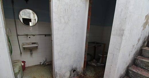
I realize this is not everyone’s cup of tea. And yes, of course, we have an architect. I have turned my drawings over to her and expect she will offer some great ideas! But 90% of you said you wanted to follow our building project and I am hoping there are at least some people like me that enjoy HGTV and graph paper. If you are so inclined, send me your ideas and drawings. And enjoy some more pics:
Next week: Portuguese pharmacies and why I love them; and weird Portuguese building regulations and how you get around them.




Looks like a exciting project!
If possible i would try to do both bedrooms in the «skinny» room, with doors/windows facing the patio and the office / living/ kitchen in the bigger room. One bad between the bedrooms and the other near the social area - living / office.
In the patio, access stairs to a rooftop.
Looking forward to see the project running!
Best of luck
I only envision the final product…..which is going to be exquisite when complete. So glad you got the ok to move forward.